Mistakes to Avoid When Choosing Brand Colors
Choosing brand colors requires a lot more than picking pretty colors
Maybe you’re looking to create your very first color palette for your brand, or maybe since creating your initial color palette your brand has evolved and you’re looking to elevate your branding to better align with your growth. Choosing new brand colors can be a great first place to visit when it comes to rebranding and refining your brand!
However, there are a few major mistakes you should avoid when it comes to choosing your new brand colors!
Mistake #1: Choosing a Color Palette Because “It’s Pretty”
While we aren’t saying to choose a color palette you hate, choosing brand colors based on being “pretty” won’t necessarily help you to evoke a response from your target demographic that aligns with your brand goals and mission. It’s important to consider color theory in your brand colors!
What to do instead?
Ask yourself what emotions and vibes you want your brand to portray. How do you want your client or customer to feel after they work with or buy from you?
Generally, these are the different emotions and values associated with each color group based on color theory:
- RED: Bold, Courageous, Energetic
- PINK: Femininity, Soft, Nurturing, Compassionate
- ORANGE: Cheerful, Fun, Confident
- YELLOW: Optimistic, Positive, Warmth
- GREEN: Health, Growth, Balance, Harmony
- BLUE: Trustworthy, Secure, Dependable
- PURPLE: Wise, Creative, Royal
- BLACK: Prestige, Serious, Classic
- BROWN: Reliable, Grounded, Approachable
As you narrow down your choices, you may also consider the colors that you naturally find yourself surrounded with on a regular basis (this makes your brand photography process a lot simpler!) and colors that you feel your target demographic would feel most aligned with.
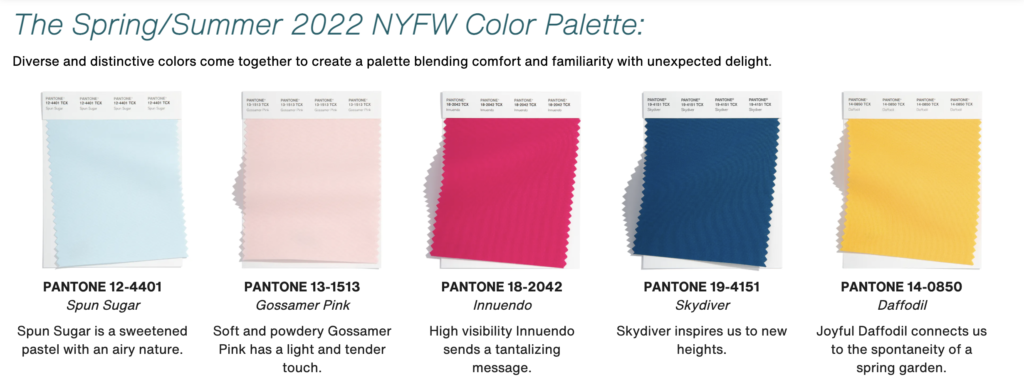
Mistake #2: Choosing a Color Palette Because “It’s Trendy”
You don’t want your brand colors to feel based on a trend! Trends come and go which can make your marketing visuals feel dated more quickly. While you could rebrand once your brand colors go out of season, rebranding too frequently can make it difficult to build brand recognition among your target demographic.

What to do instead?
If you love staying on top of trends, choose to incorporate trendy colors that work well with your brand colors. That way as they come and go, you will still have a color palette that remains consistent and builds brand recognition.
Mistake #3: Choosing Colors *Too* Strictly Based on Color Theory
While color theory is important to consider, it doesn’t need to be the final say in choosing your brand colors. Your brand colors are going to stick with you for awhile, so it’s important that YOU feel aligned with them as well!
What to do instead?
Create a mood board! Our favorite way to do this is to create a Pinterest board and fill it with images that give off the vibe that you feel aligns with your company. We even instruct all of our design clients to do this during our onboarding process. They don’t need to be related to your industry at all! Once you have a board full of images, you may start to notice trends in colors across your images.
In conclusion: choosing brand colors is a combination of following theory and personal preferences. Let it be fun!
Looking for professional support to develop a signature brand identity? Jetpass Media works with sports and travel brands to design custom branding, beginning with a foundational brand strategy. Reach out to learn more about working with us to redefine your brand in a way that will live an ongoing legacy.